

Step 3 feels like the RestOfTheFuckingOwl
Came here looking for this comment.
You can add little triangles to the end lines of each arm then a small building underneath and a swastika is now a windmill
That’s both wholesome and at the same time too much work for something that’s probably getting defaced the next day.
I thought it was going to be

ELI5?:(
I kinda like this as a solution as well. Still completely wipes the swastika and adds niche humor.
Ah yes, miscarriage. Classic comedy.
Honestly, it’s more metahumor at this point.
2 is dangerously close to loss.

Loss Wins
A simpler alternative
I was expecting Loss, tbh.
I had to look twice.
Honestly loss wouldn’t be a bad option either for when the lines are drawn terribly
That would be a new low.
If you’re pressed for time, there’s always the Three Arrows

The Three Arrows against monarchism, communism and fascism. Nice.
You can also just add words to rasict graf

Ranger

The guy who was as strong as the whole team of normal Rangers?
The team where they were literally color coded by race btw, except for the gay boy in blue.
Maybe less of a recapture because of direct directorial mandates than you would hope is all I’m saying
That was a rather unfortunate consequence of not reading ahead in the material. Not much they could do about it either, since they wouldn’t have the budget to film enough of their own scenes in the costumes until much later.
It’s a consequence of the director being a publicly verified twat, but otherwise yeah. It certainly wasn’t the intent of the original Japanese show runners.
While the color coding could have been unfortunate coincidences, David Yost, the actor for the first blue ranger was bullied off the production for being gay.
https://en.wikipedia.org/wiki/David_Yost#Career
According to Yost, he was often called a “removed”, and the producers frequently questioned other cast members in private about his sexuality. Yost left late in the fourth season after a week of contemplation and thoughts of suicide instead of continuing work another six months into the second film. He stated that the co-workers involved with writing, filming, and producing the show considered him “not worthy” to be where he was and that he “could not be a superhero” because of his homosexuality.
Could have gone with White Powerless. Or White Bowery. White Plower?
White Powerless is a great song from a great album by John Congleton!
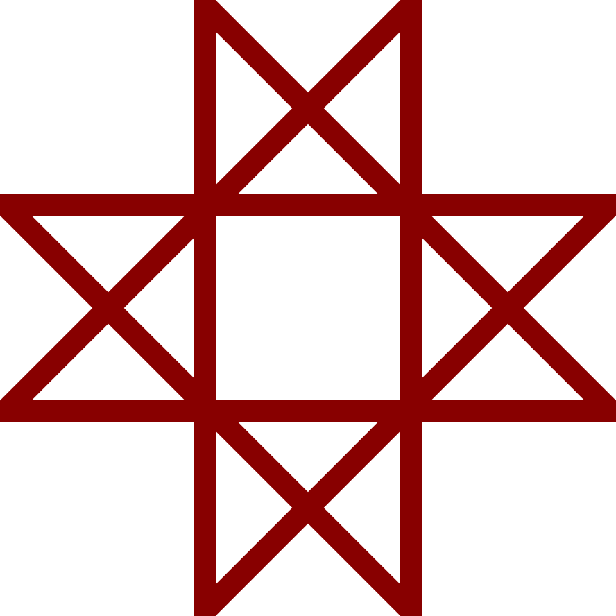
If you have to run away after step 1, don’t worry. The Windows logo is still a slight improvement.
usually the lines aren’t straight anyways, i’ve turned a couple into quite nice windows xp logos!
Yeah ive seen and done the same!
Some older gas cylinders (like for welding) have the 4 boxes symbol. I’ve heard that they originally had a swastika, but after WWII the old mark was obscured for obvious reasons.
I like the one with the trash can better.
Yeah but nazis tend to draw the swastika the flipped.
looks at step two
step one will do it
Gonna carry a sharpie around with me for When that skinhead with the tattoo on the metro falls asleep.
Saving this for later. Although most swastikas I’ve seen around are badly drawn lol
“hail hortler”
I like that, even though it’s plainly not reversing the swastika.
I prefer to make them into loss but you do you
,̶’̶ ̶ ̶,̶ ̶|̶ ̶,̶’̶ ̶_̶’̶
I prefer this smaller version:
:.|:;


